Private markets / Success case
The research report redesign that turned a family office survey into a lead engine
A merchant bank and a private equity firm had the data and the insight. They needed a report family offices would open, read and reply to.
At a glance
Family offices surveyed
75+
Content as written, design rebuilt from the first page to the last.
- ContentKept as written
- DesignRebuilt
- DistributionThe firms’ opening move
- LeadsFlowing
Objective
Qualified family office leads
The report as the firms’ opening move
Two firms
One publication
Reads as a single authored piece
Client
US merchant bank and European private equity firm, co-publishing a research report on family offices and private markets
- Family offices
- Private markets
Scope
- Design only
- Visual system
- Layout
- Data visualisation
The challenge: strong research that looked like a survey export
The content
A survey of 75+ family offices on allocations, direct deals, syndicates and governance, with insights from two firms that have worked with over 300 of them.
The problem
It looked like a survey export: dense pages, charts straight from the survey tool, two logos on the cover and no reason to keep scrolling.
The brief
Make a family office principal stop, read and want the conversation, with the content kept exactly as written.
What we learned: why research reports fail to generate leads
Most reports get skimmed for thirty seconds and filed. The numbers explain why.
- 50%+ of decision-makers get no valuable insight from the thought leadership they read
- 45% lose respect for a firm that puts out subpar content
- 55% abandon content that fails to engage within the first minute
- 71% prefer short-form, so a report has to work as a two-minute skim
And most reports are designed for the author: every finding at the same weight, charts that need a legend, pages that read like a Word file.
What makes a report convert, and how this one does it
73% of decision-makers trust thought leadership more than marketing, and 45% say it led them to award business. Design is what makes it land.
Visible authorship and rigour.
One publication from two firms, with a cover that looks like it came from a house family offices trust.

Insight in the reader’s language.
Findings for family offices, in their numbers and their language, with the headline figure large on every page.
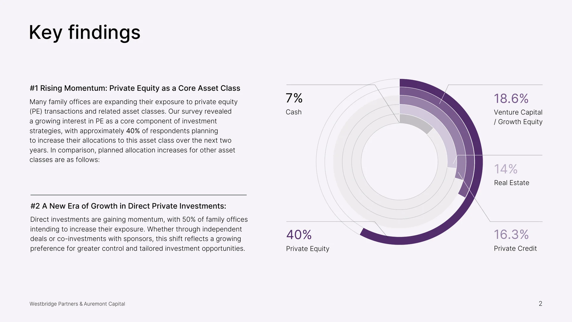
One point per page.
Front-line insights like the co-investment deal funnel, laid out so each spread reads in a single pass.
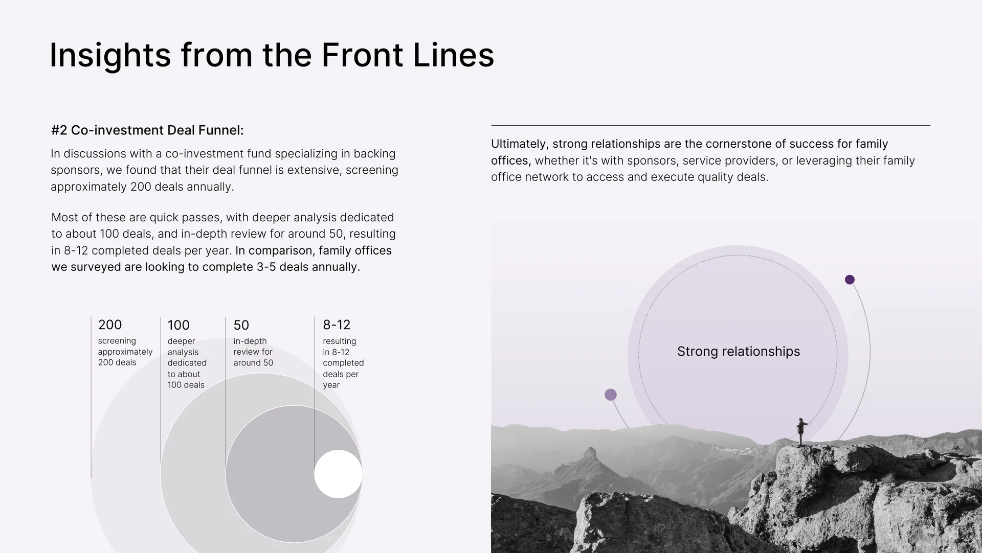
What we did: design only, from the cover to the contact page
The content stayed as written. The design was rebuilt from the first page to the last.
Visual system
A restrained palette, editorial typography and full-bleed photography, with both firms’ identities in one system.
Data design
Every finding got one visual: the headline percentage large, the chart built to carry the point without a legend.
Hierarchy and pacing
A skim path: summary, findings as spreads, insights with imagery, quotes as breathing room, and a contact page.
Readability
Dense paragraphs broken into findings, key numbers pulled out, and margins that let each page read in one pass.
Built to be forwarded
A partner can send it to a family office contact, and the first spread does the selling.
Results
- Lead flow from distribution onward: the report became the firms’ opening move with family offices
- 2 firms, one publication that reads as a single authored piece
- Content untouched, design rebuilt from the first page to the last
The research report


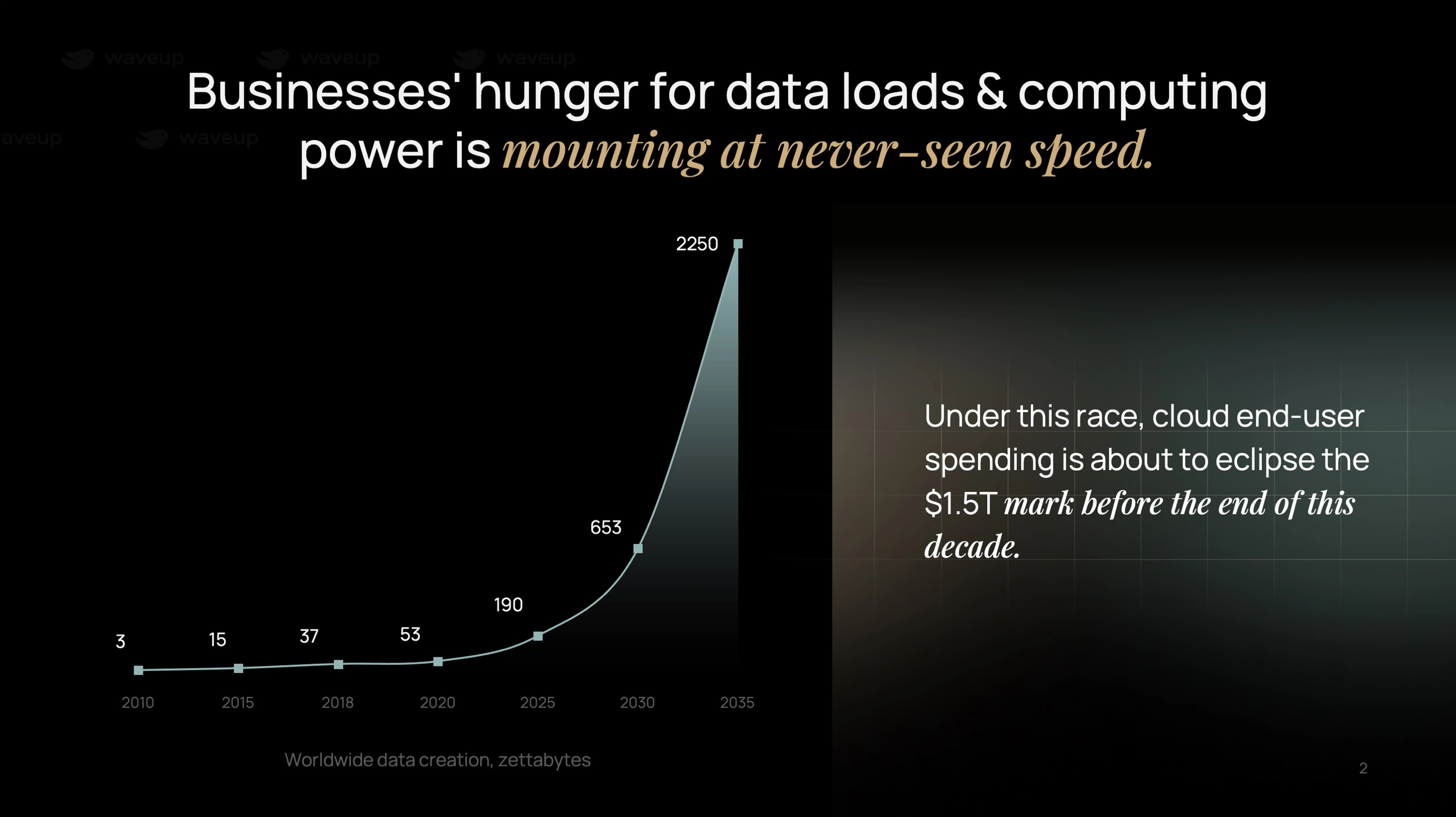






 56VCs interviewed

Fundraising 2025 study: Lessons from 56 VCs
Read the story $50Mfund raised
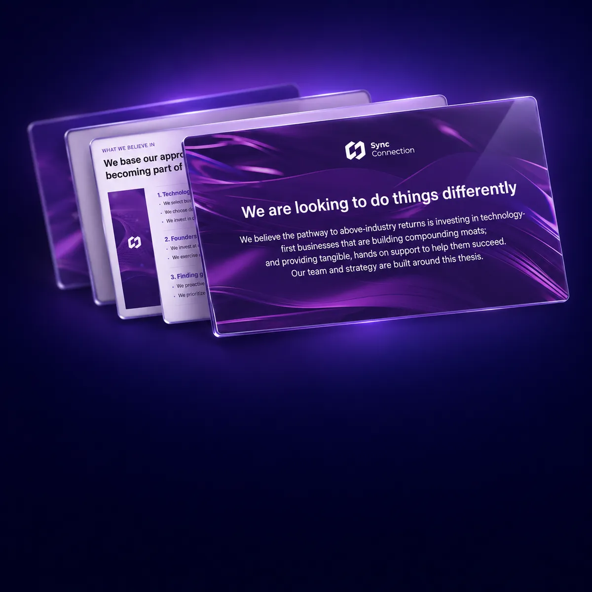
$50M pitch deck for a VC fund
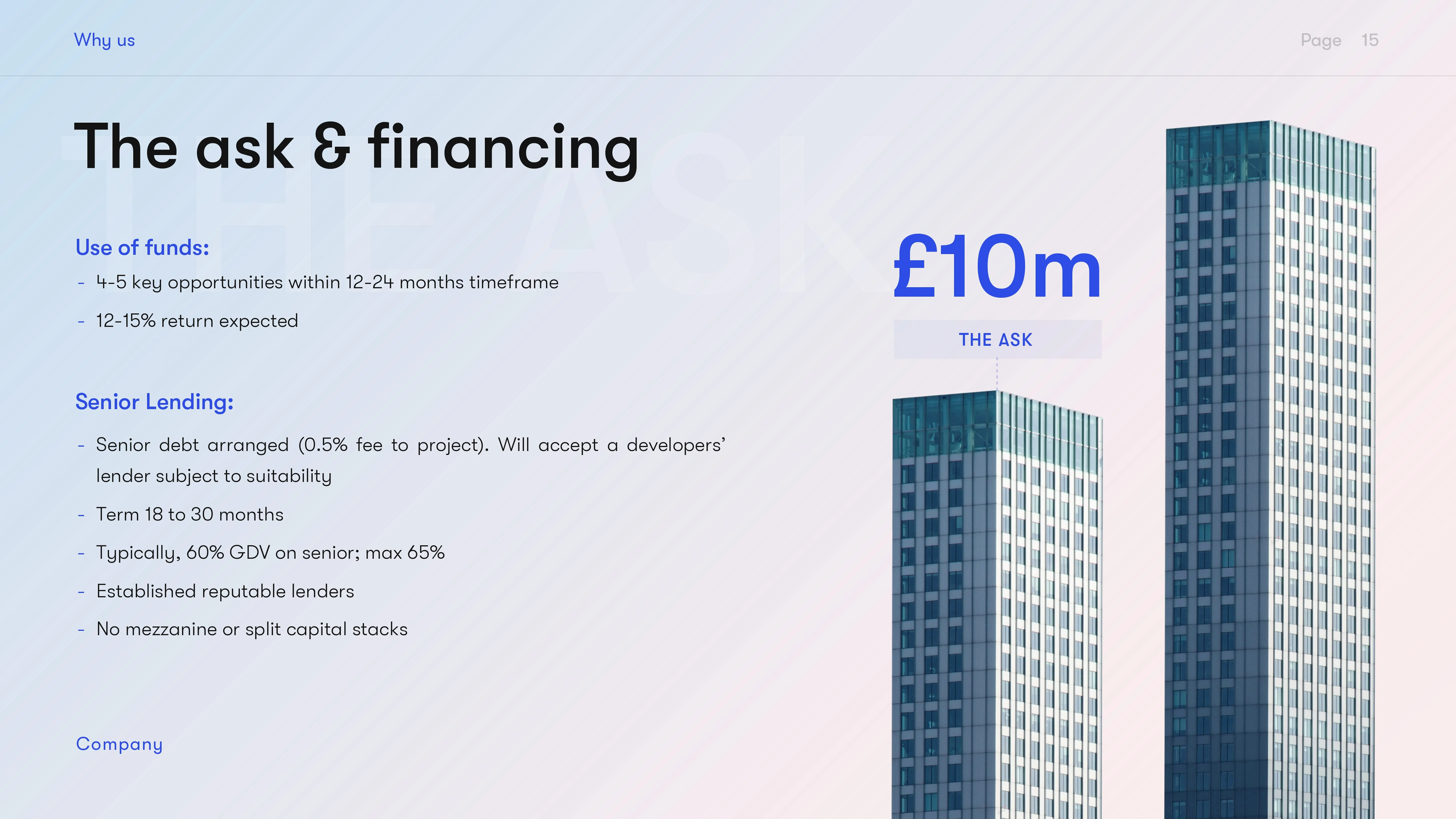
Deck rebuilt in 14 days3 months to closeRead the story £3Mdebt raise, in market

Building the £3M debt deck for a live entertainment company
Sold-out London debut2027 UK and Europe rolloutRead the story $100M+nickel project investment case

$100M+ nickel mining investment case: market analysis, financial model and deck
Saudi industrial group~60% operating marginsRead the storyHave a report full of good data that nobody reads?
Waveup designs research so it generates conversations.

